PROSPERITY DIGITAL MARKETPLACE
PROJECT OVERVIEW
ABOUT PROSPERITY DIGITAL MARKETPLACE
Prosperity Digital Marketplace (PDM) is a small tech startup and a subsidiary of United Way Western Connecticut. PDM's digital platform, Prosperi-Key, connects households living paycheck-to-paycheck with businesses and nonprofits in their community who want to help. It's a marketplace that aims to make life easier for hard working households.
UX CHALLENGE
PDM came to us because they wanted to better understand user drop-off during the onboarding process. Specifically, they wanted to know why users were abandoning their application during the income verification process.
ROLE
UX Researcher
UX Designer
TEAM
Courtney Lyons Lopez
Simon Burdeaux
Elizabeth Shin
Sandra Hamlin
TIMELINE
3-week design sprint, February-March 2022
UNPACKING THE CHALLENGE
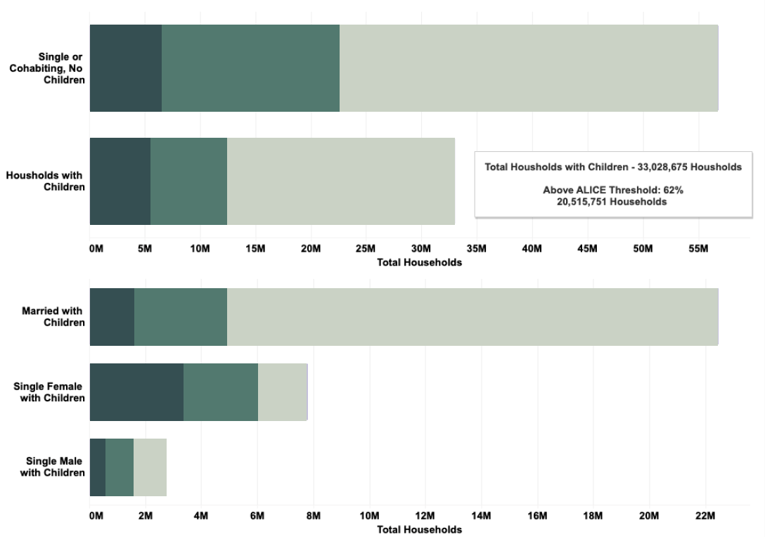
WHO IS PDM TRYING TO HELP?
ALICE, which stands for Asset Limited Income Constrained Employed, refers to a demographic of people, who in 2018 made up 29% of the U.S. population. Those who fall within the ALICE threshold are just above the poverty line and therefore don’t qualify for government assistance, but are just barely making ends meet. Prosperi-Key knows that this is a hardworking group of people, and offers them a helping hand.
WHAT DOES THE APPLICATION PROCESS LIKE?
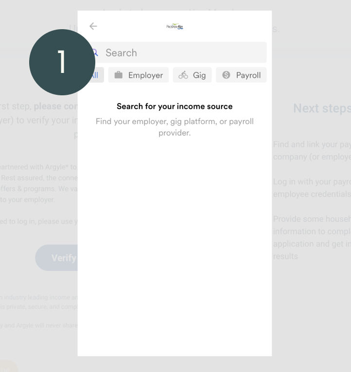
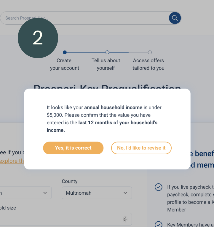
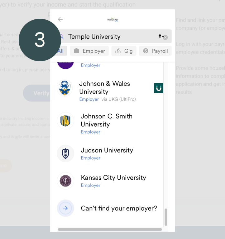
We conducted a UX audit on the platform to jumpstart our research process. In our audit we found several pain points with the income verification process, including:
- No way to exit out of the third party income verification system (Argyle)
- A popup screen occurs whenever you enter only 2 digits of your income
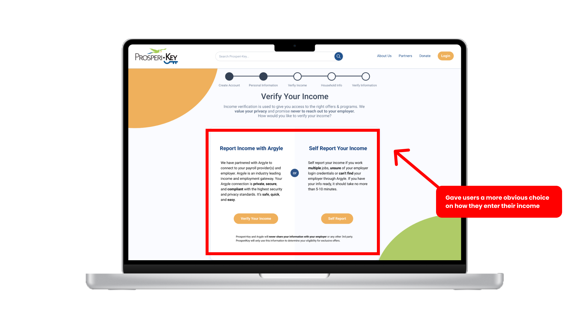
- Hard to navigate to the "Self Report Income" page
USER RESEARCH
USER INTERVIEWS
We interviewed 5 people who are currently in the ALICE population or have been in the ALICE population at some point in their lives. Most of these users had experience applying for assistance programs.
USER INTERVIEW TAKEAWAYS


USABILITY TESTING STAGING SITE
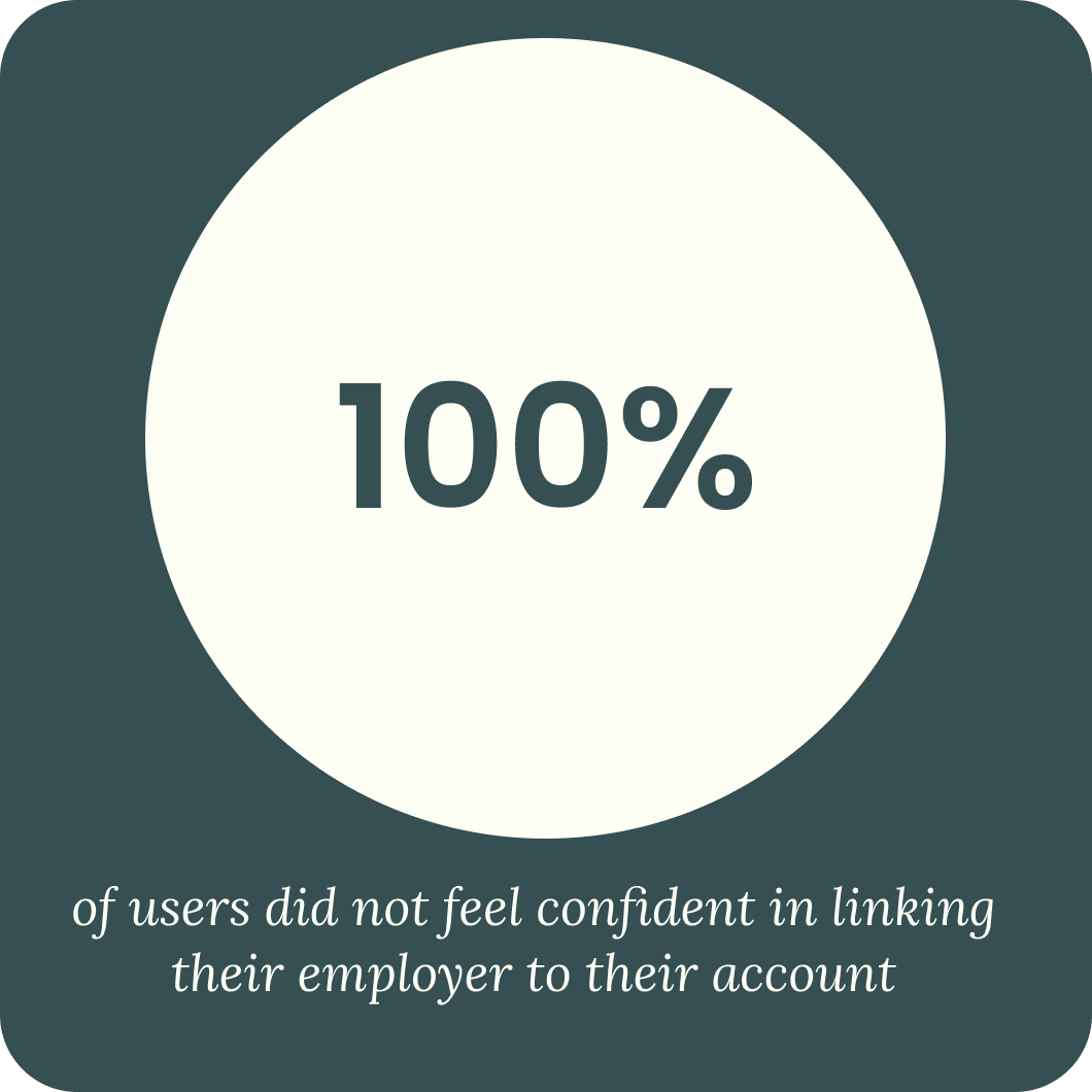
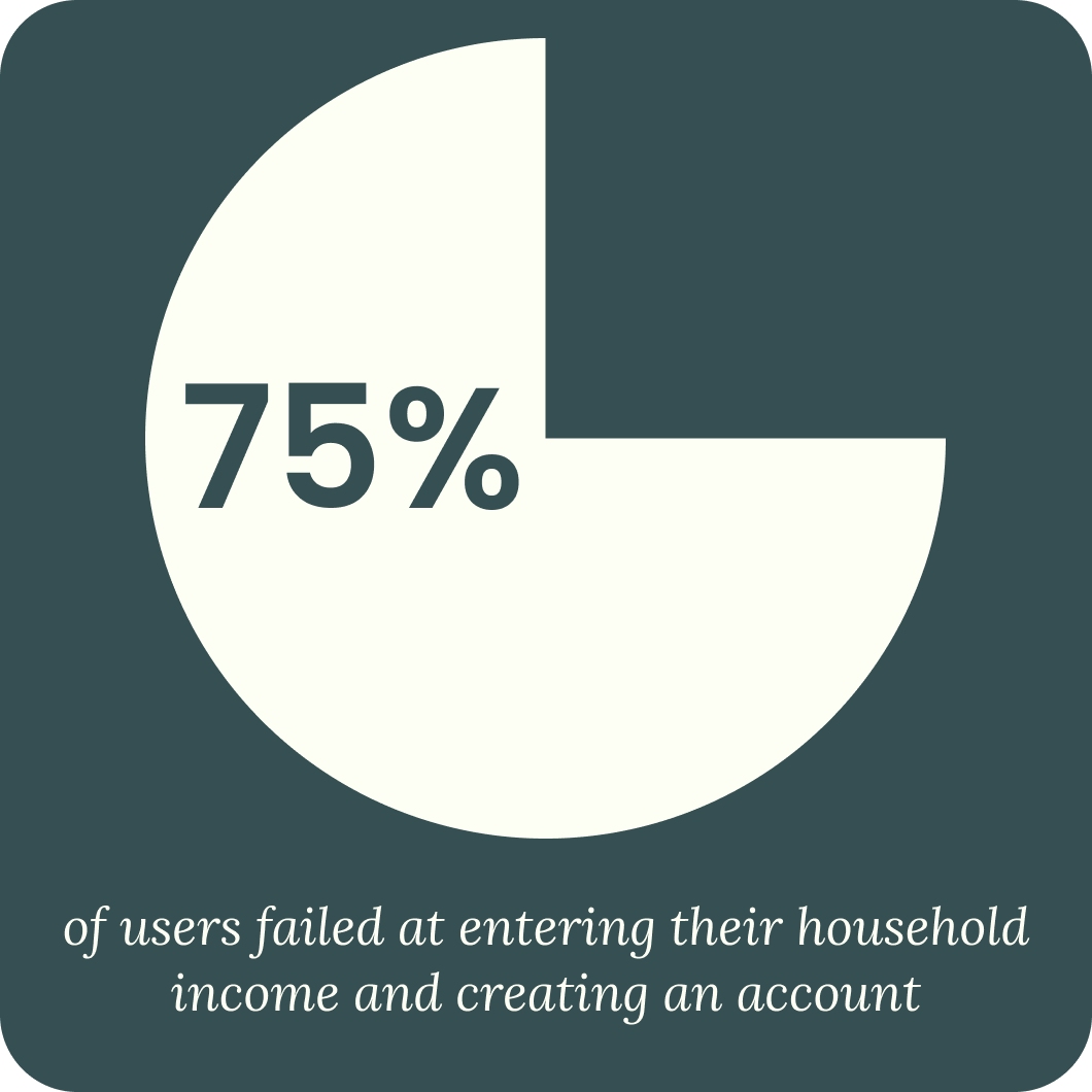
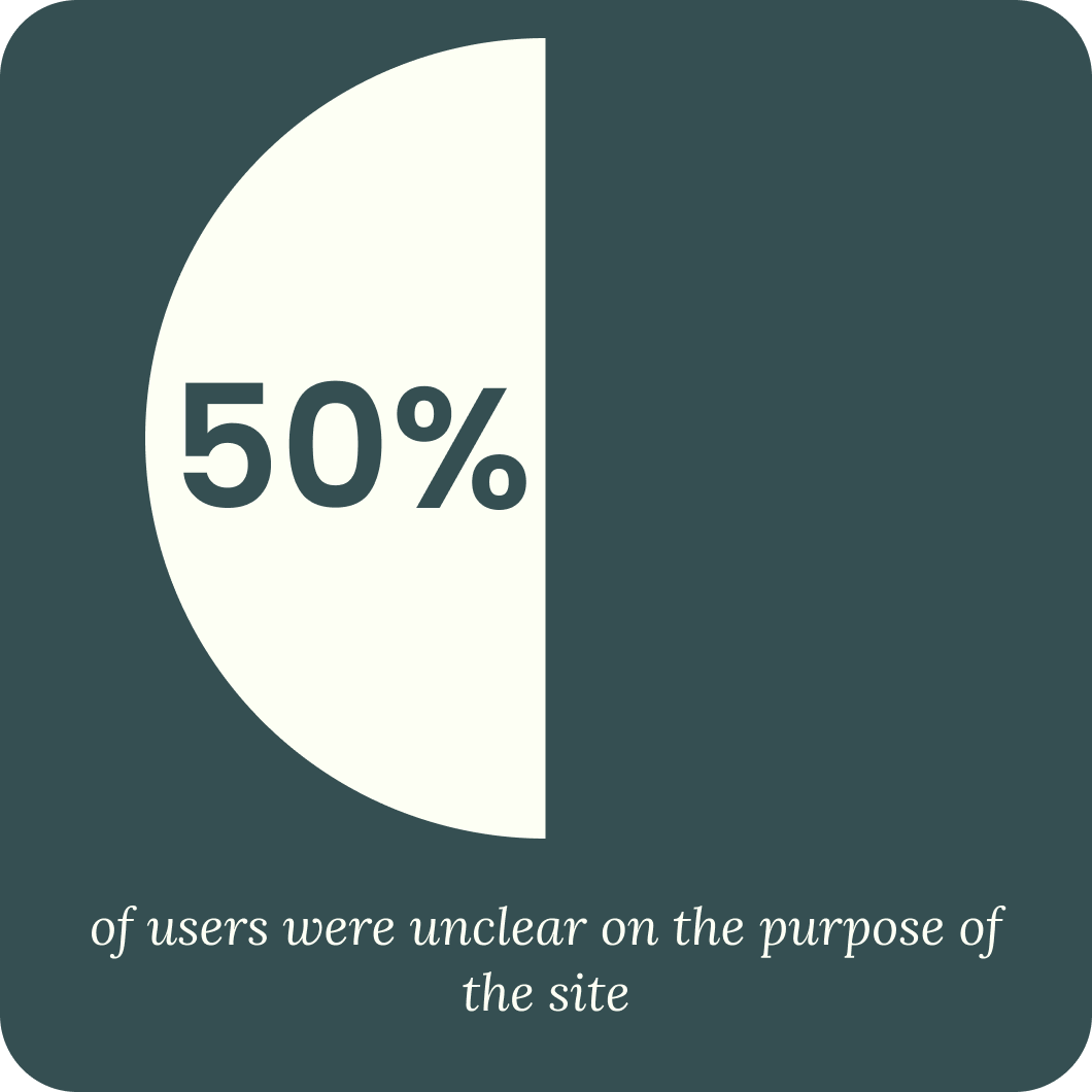
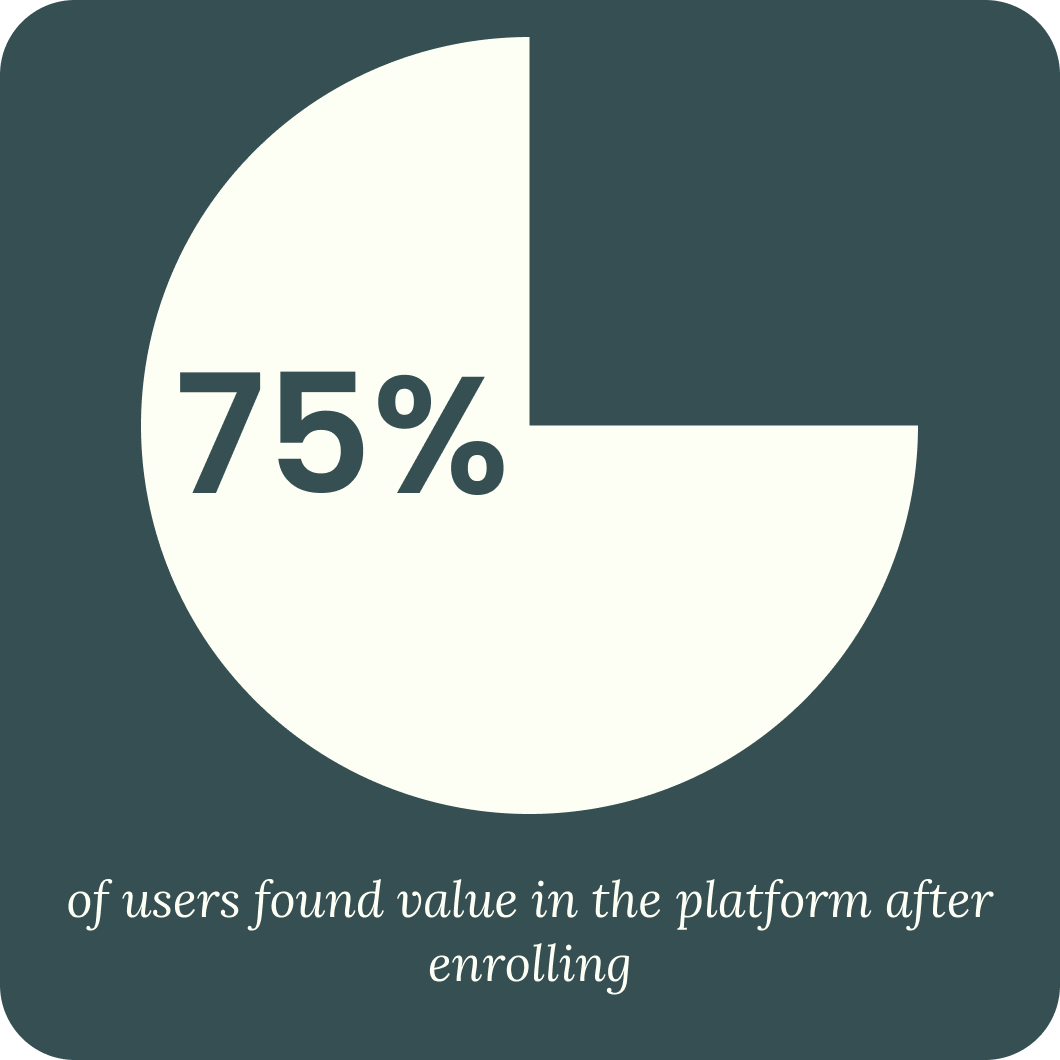
We conducted 4 Usability Tests on Prosperi-Key's staging site. We measured the success of each task by timing the task and counting the number of clicks each user needed to complete a task.
SYNTHESIS
USER PERSONA
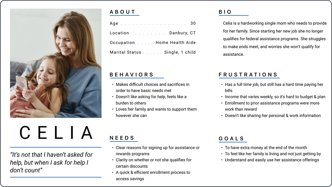
Celia is a hardworking single mom who needs to provide for her family. She is employed, but still has a hard time making ends meet. She is short on time, so the Prosperi-Key's platform needs to convince her that this service is for her and it’s easy to sign up for.
JOURNEY MAP
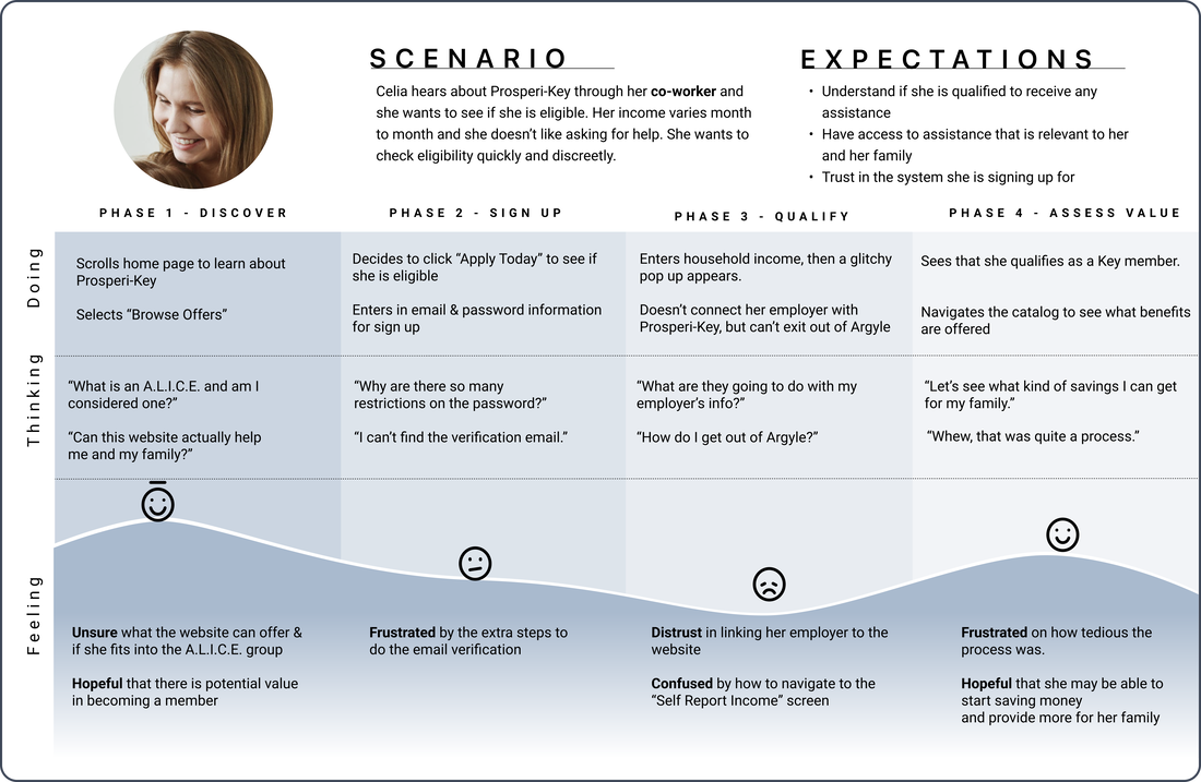
In our journey map, Celia hears about Prosperi-Key through her co-worker and she wants to see if she is eligible. She is a little unsure and frustrated as she goes through the application process, but in the end, she is hopeful that this platform can help her.
PROBLEM STATEMENT
Our problem statement prioritizes Celia's need to comprehend the value of the platform and a streamlined onboarding process.
Celia needs a way to quickly and confidently know if she qualifies for Prosperi-Key in order to utilize the benefits of the program and be in a healthier financial position.
HOW MIGHT WE...
After developing our problem statement, we came up with 3 "How Might We" statements to help Celia. They touched on Prosperi-Key's onboarding process as well as the transparency of the site.


IDEATION
C&C ANALYSIS
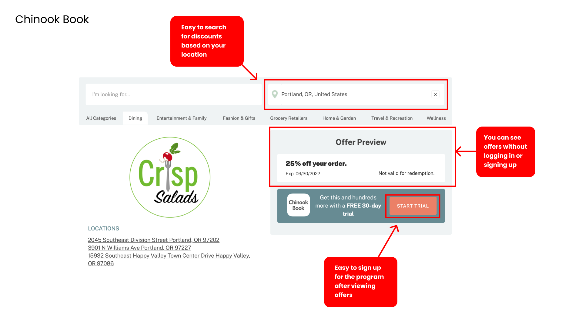
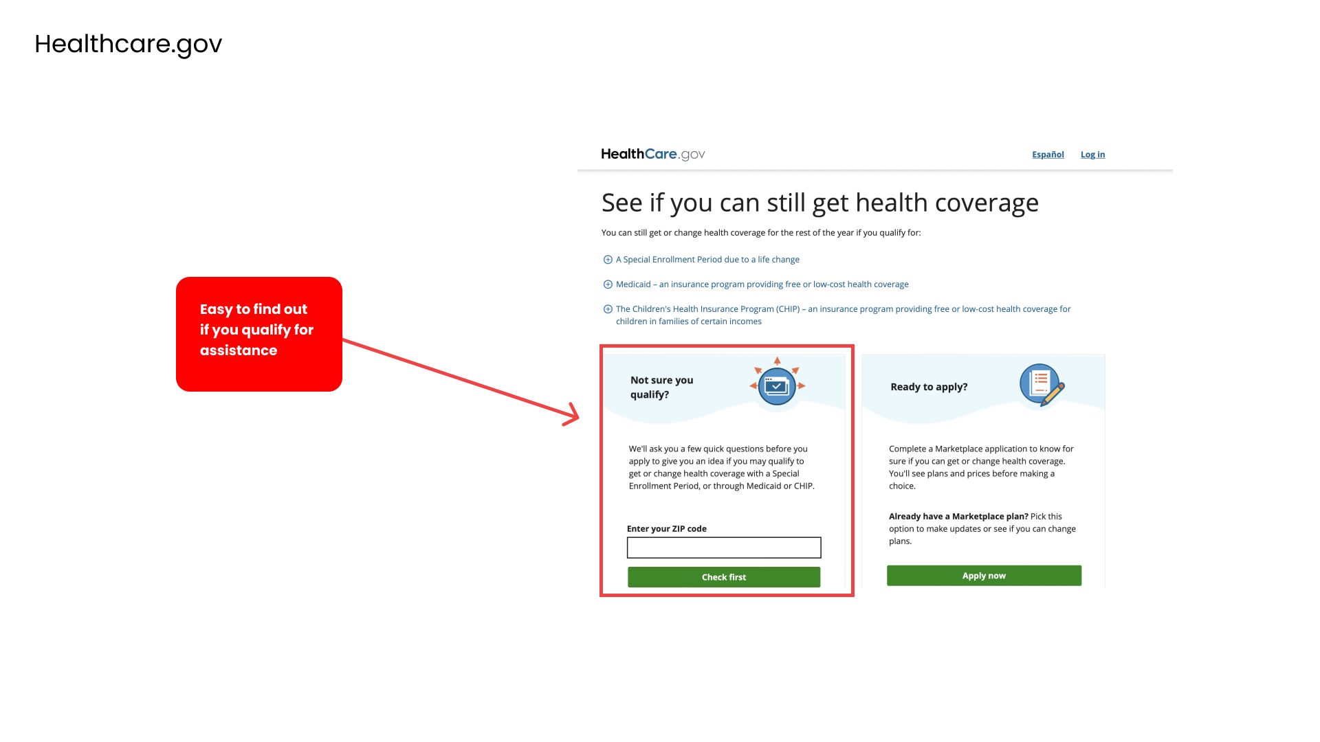
After synthesizing our research, we decided to take a look at programs our users mentioned during our interview process. These programs have similar sign-up, rewards, and benefits features.
We found that two of the sites, Chinook Book and Healthcare.gov, had tools in place that could help solve our client's key issues with onboarding.


USER FLOW FOR PROSPERI-KEY SIGN-UP
To help us align our visual layout with our design solutions, we then created our User Flow. Our main goal was to make the process easy for the user, instill trust, and increase transparency so the user can get through the sign-up process.

HI-FI PROTOTYPE
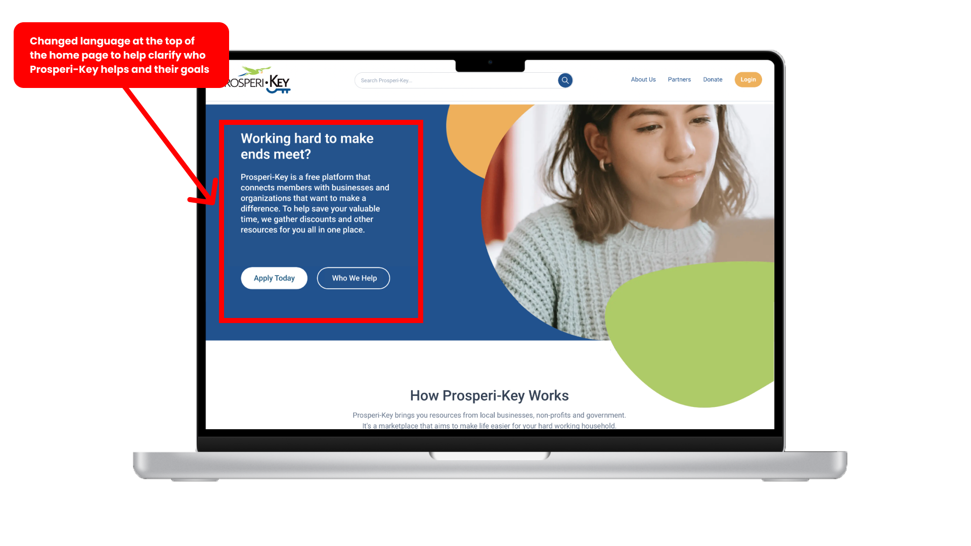
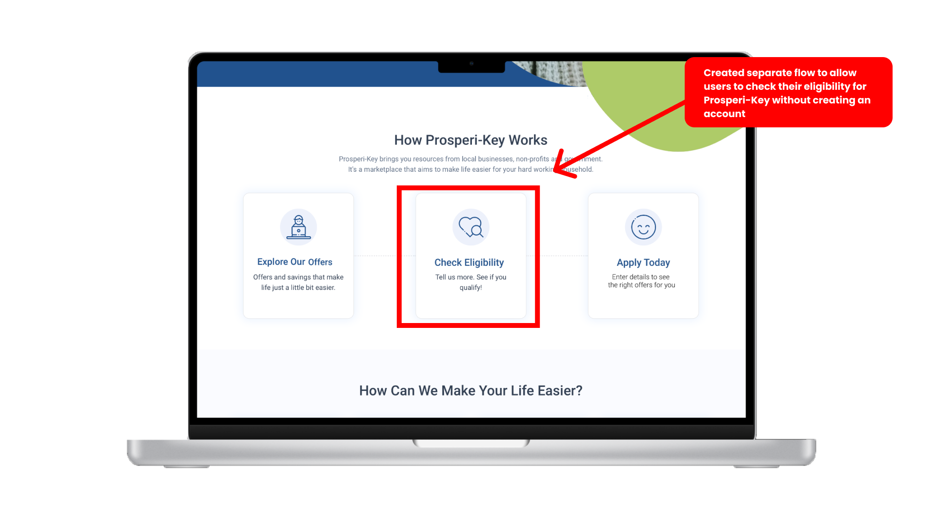
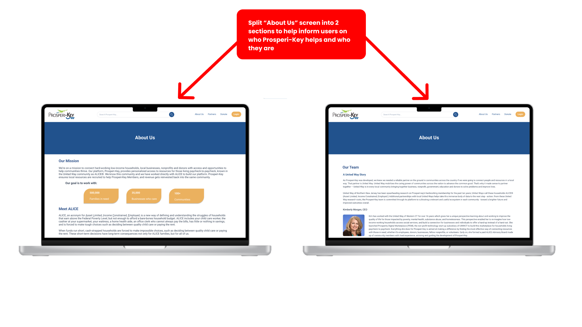
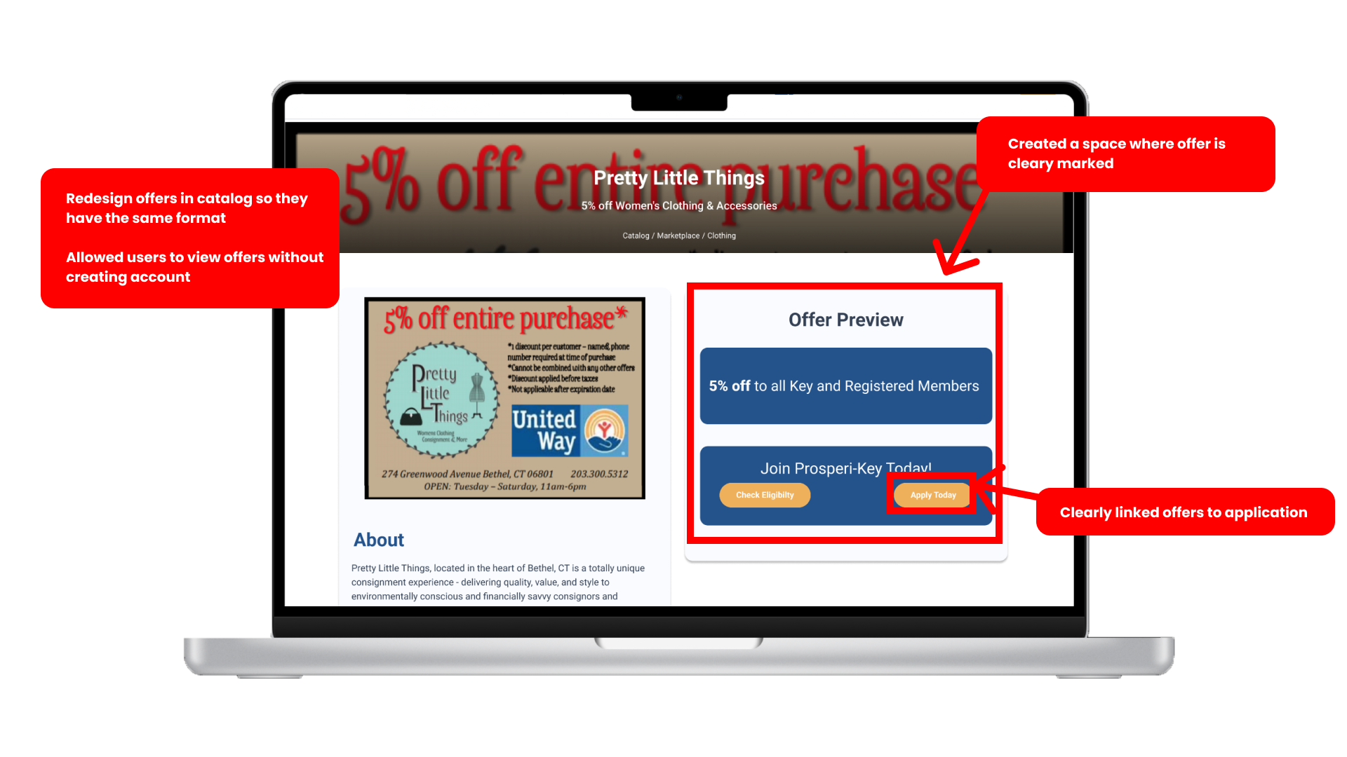
We made some adjustments to the current platform based on our user research and our C&C Analysis. PDM was happy with the UI and general layout of the site, so we continued using the current design and made minor adjustments to test our research. Here are our findings:
USABILITY TESTING FIRST ITERATION OF HI-FI PROTOTYPE
We conducted 4 Usability Tests on our first iteration of the Hi-Fi Prototype. We measured the success of each task by timing the task and counting the number of clicks each user needed to complete a task.
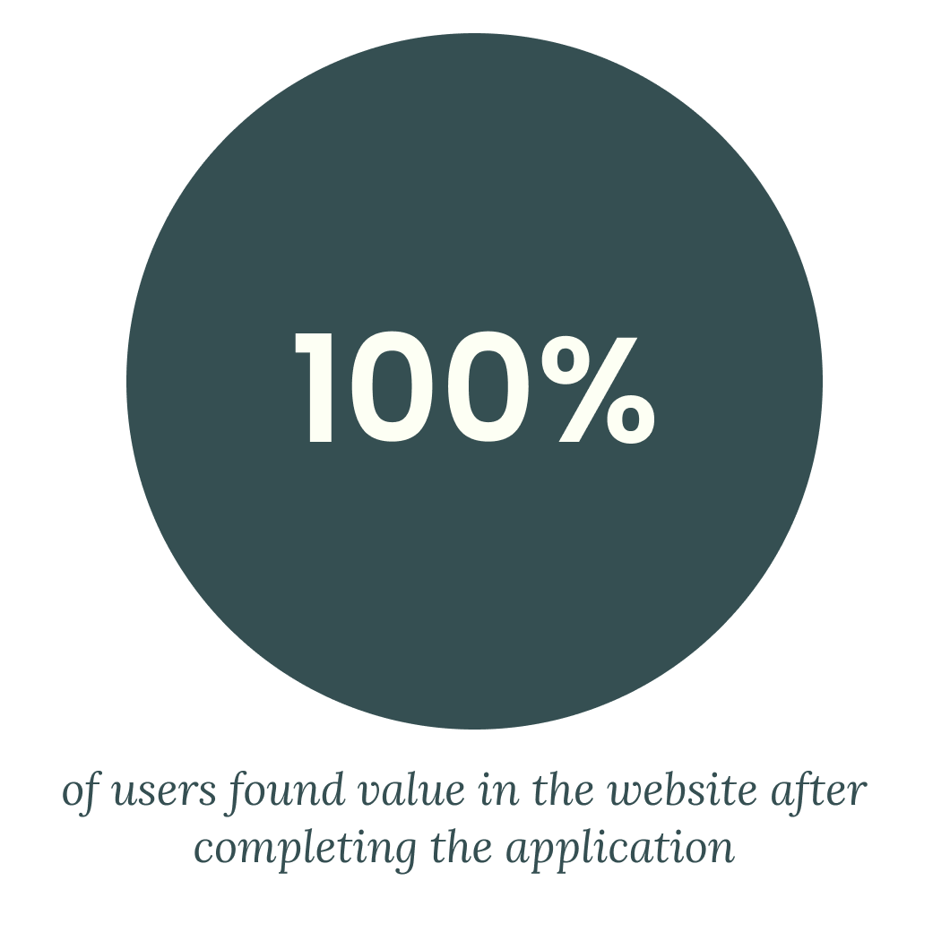
SECOND ITERATION OF HI-FI PROTOTYPE
SECOND ITERATION
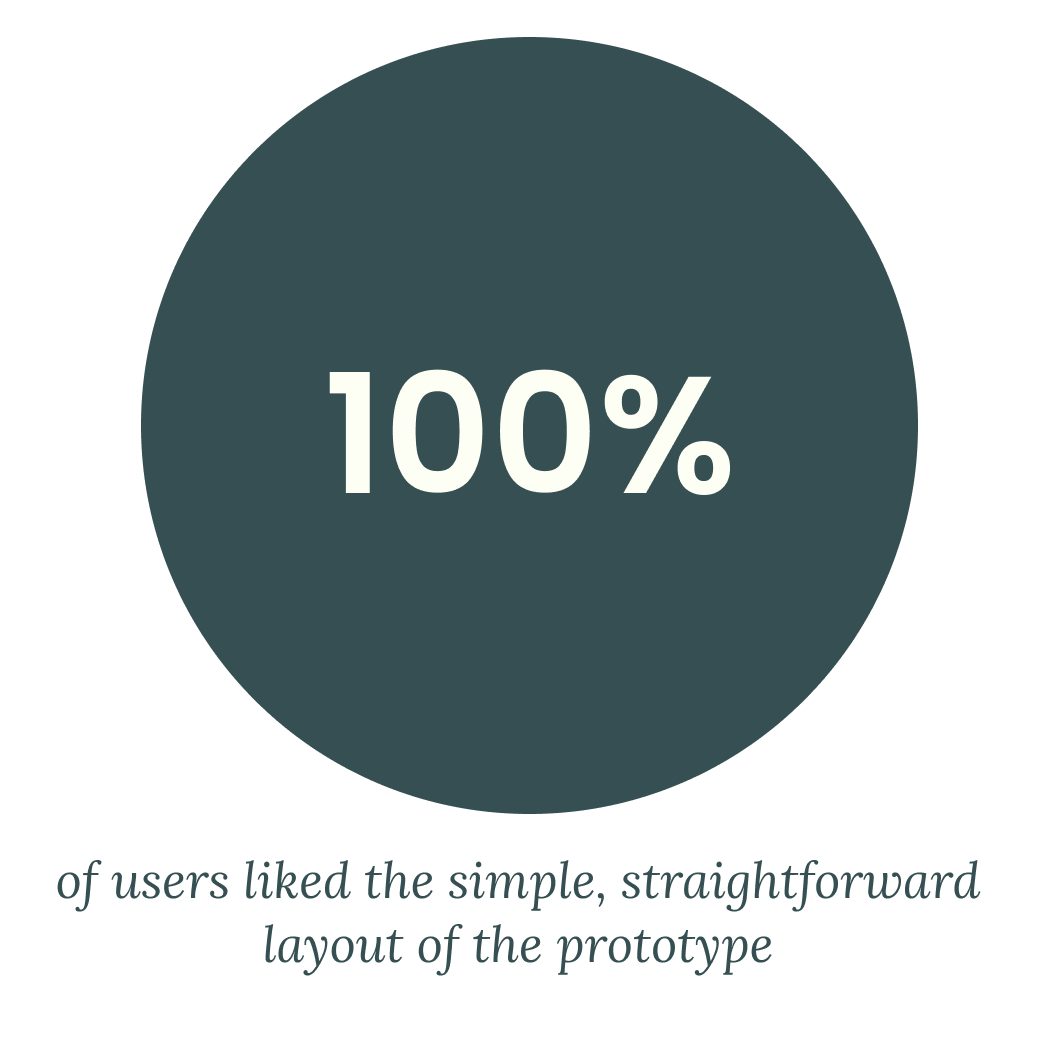
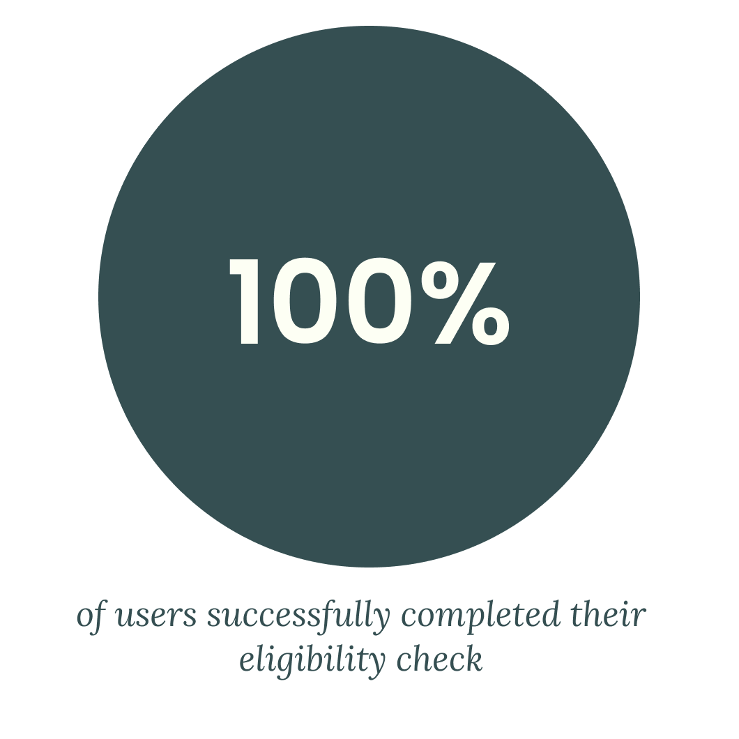
We decided to make a few more changes based on user frustrations from our second round of testing.
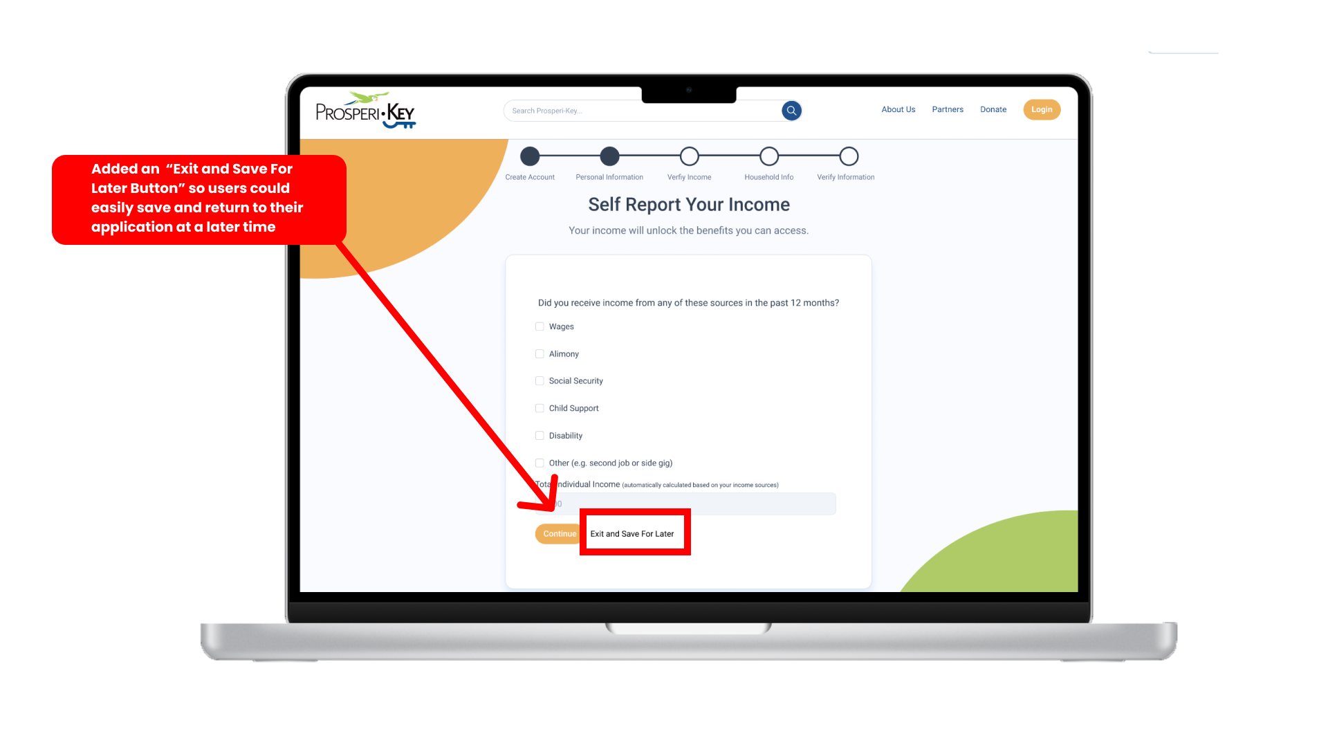
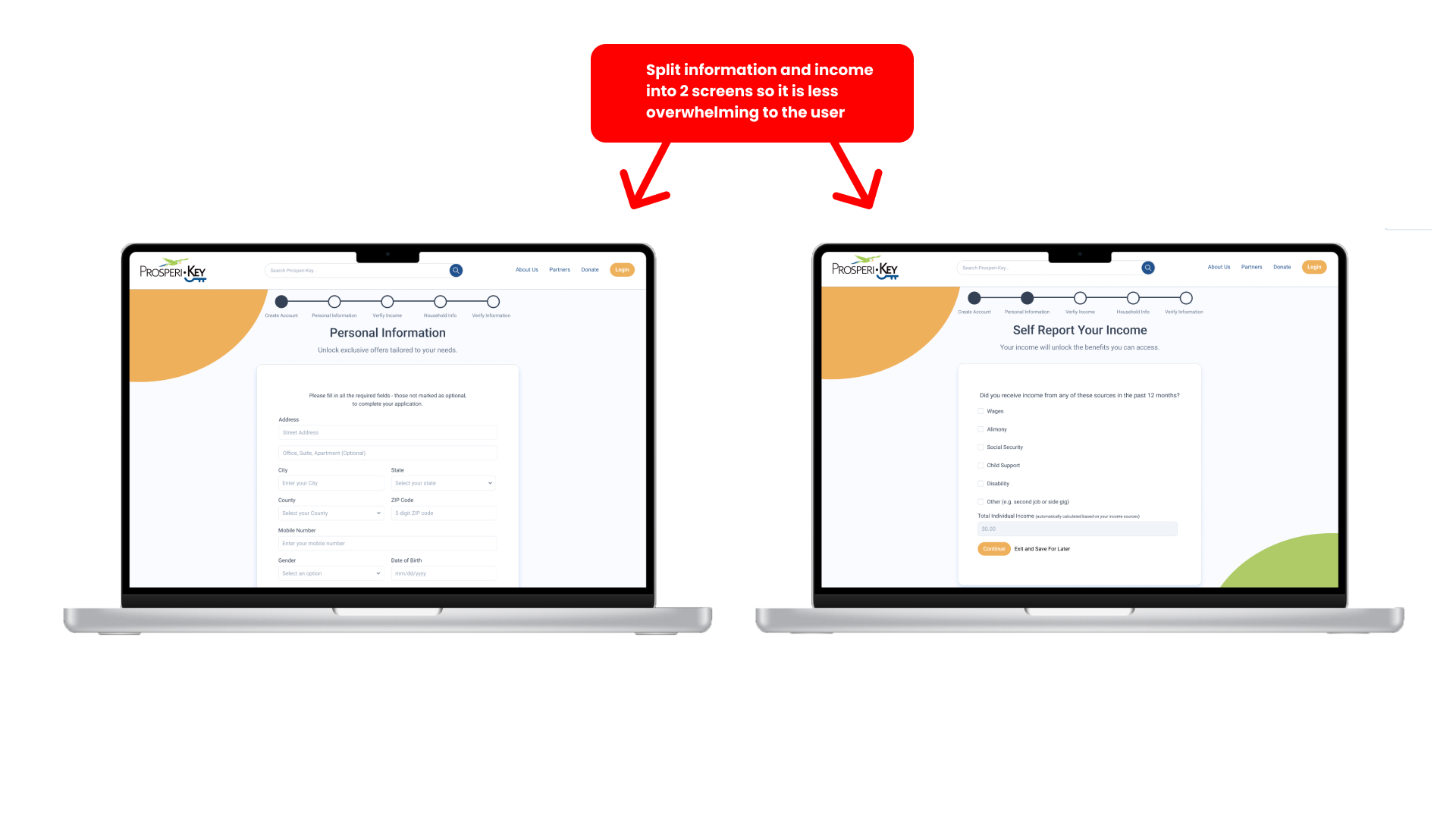
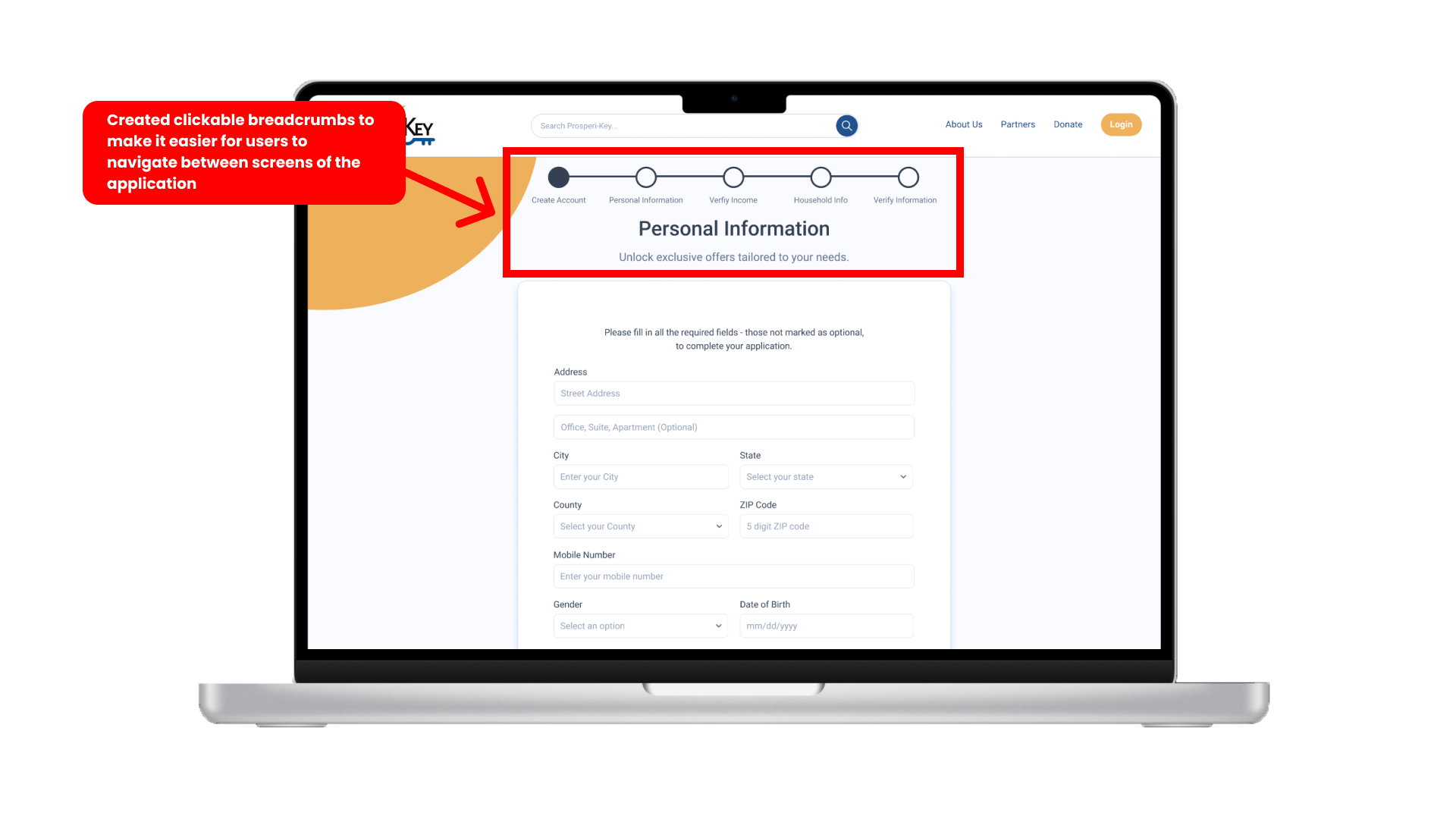
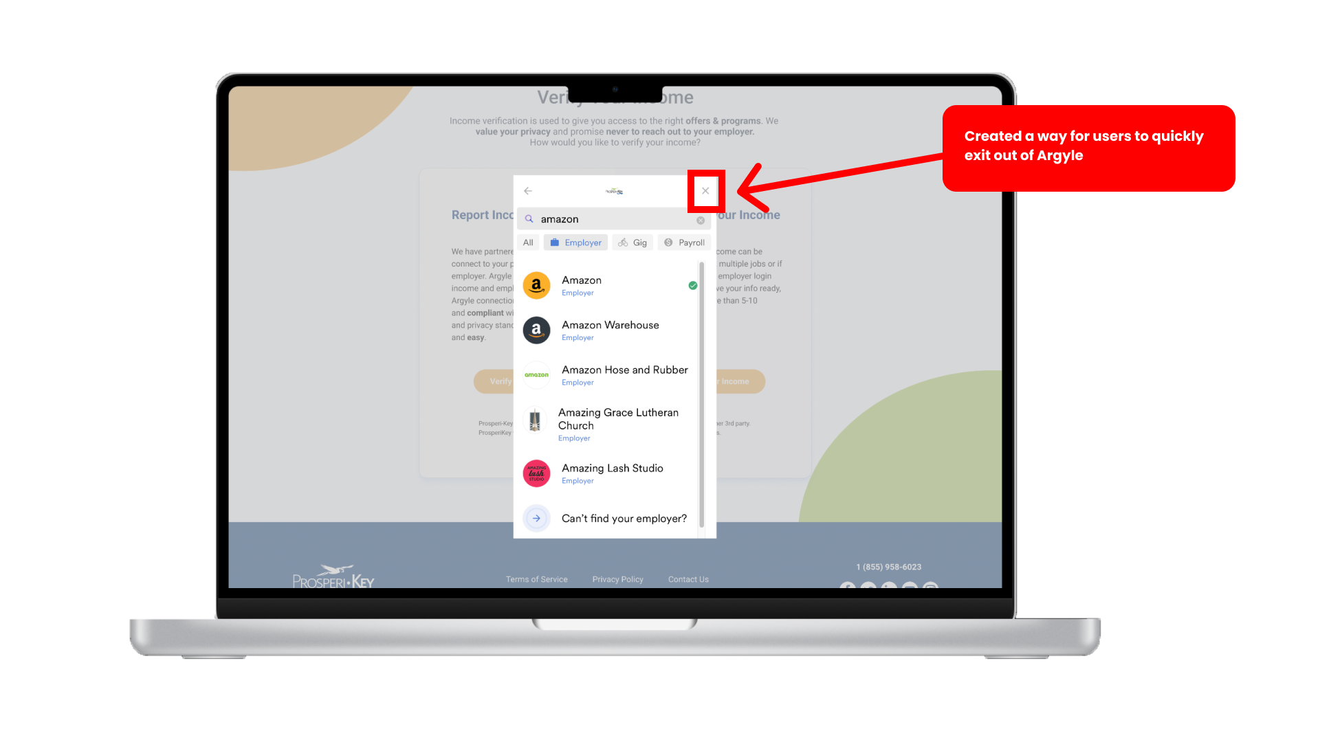
SECOND ITERATION HI-FI PROTOTYPE
NEXT STEPS
Conduct a card sort
Users were confused by how some of the benefits were organized. We recommended a card sort to help categorize the platform's offerings.
Continue streamlining application process
Users were still frustrated by the amount of personal information the site asked for. We recommended removing any information ask that isn't completely necessary.
Filter benefits by location
Some users were finding benefits for users in a different state that did not apply to them. We recommended keeping offers relevant to their users.
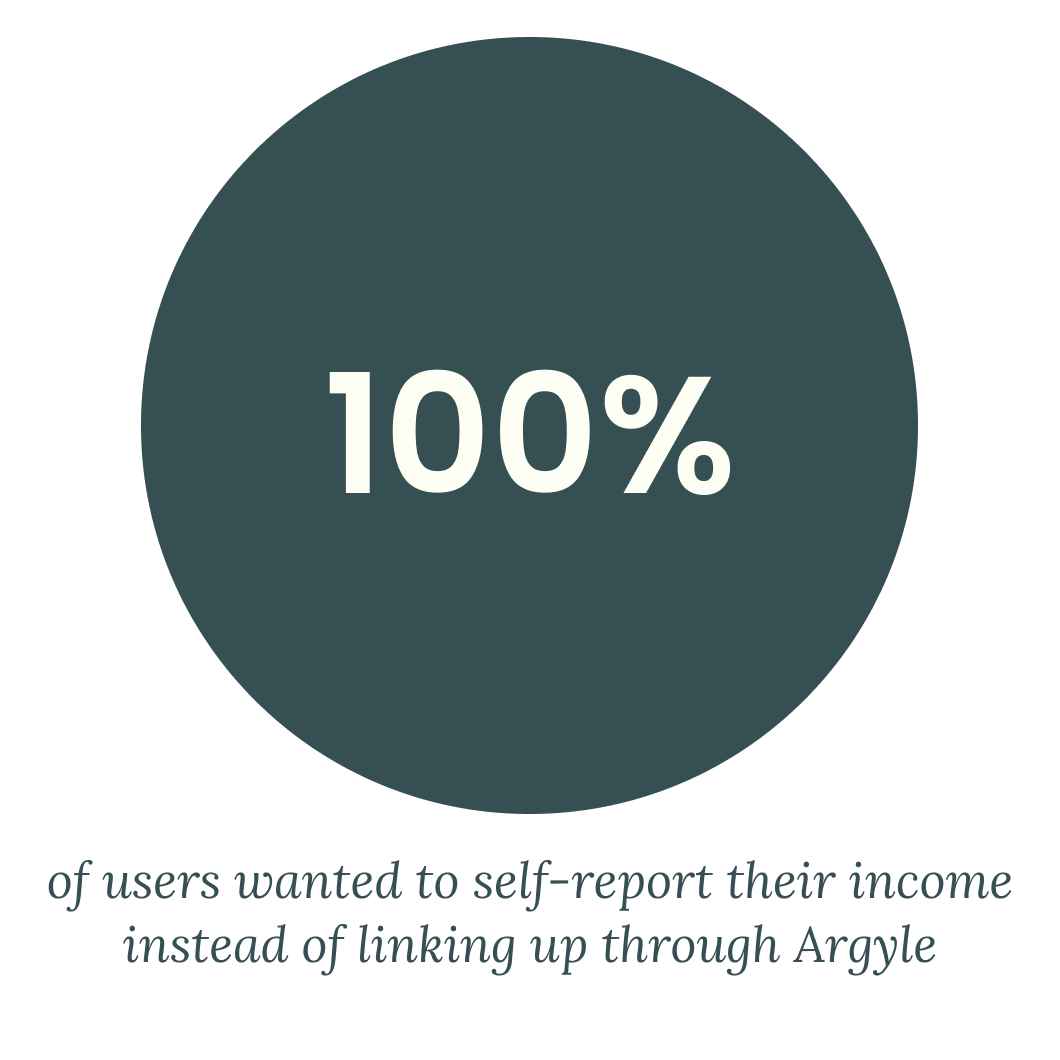
Create alternative ways for people to verify their income
Users wanted other ways to verify their income, like uploading pay stubs.